MIT D-lab’s P.ACT: Partnership Co-Design Toolkit

It’s finally here! MIT D-Lab has published their P.ACT: Partnership Co-Design Toolkit. I’ve been involved in their learning lab to try and test various tools in the kit, which included the Partnership Canvas.

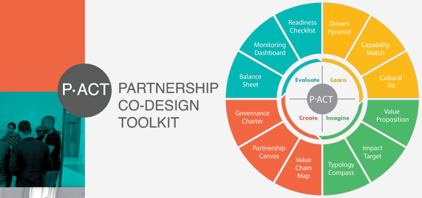
The result is a very comprehensive overview of tools, ranging from tools that you can use in the process of discussing partnerships, as well as tools for formalising collaborations, and monitoring and evaluating. The figure below shows the full toolkit menu, covering a full life-cycle of a strategic partnership.

A review

The toolkit intends to cover the full range of dialogue, planning and execution that needs to take place in setting up a strategic partnership. The tools are very much focussed on the process of co-creating and collaboration in this process, both internally in your own team/organisation, and with partnering counterparts. This is very much needed, as strategic partnerships tend to break down mostly due to failures in communication.

If I had to provide one point of critique on the Partnership Co-design toolkit, it’s that it misses a connection with how a partnership practitioner searches for support and insight.

The way the kit is presented emphasises its own process over that of the practitioner’s intuition and how they navigate the challenge of partnering. The practitioner isn’t supported with light-weight entry points to pick and choose based on their needs and circumstances. This might create some friction for practitioners to understand the value that kit offers and to adopting the tools.

But I think that if you leaf through the toolkit and get a sense of the various tools that it offers, you can start to see it more as a “pick and choose” to your particular needs.

And there are some really great tools to discover, like my favourite, the “Balance Sheet”. This is a tool for listing and comparing the value gained, and cost incurred for each partner, and also providing transparency on this between partners.

Overall the toolkit is a valuable addition to the playbook for partnership and alliance professionals, and it was fun and insightful to take part in its creation. Take a look for yourself, and let me know what you think. The Partnership Co-Design Toolkit is available for free.


Interested to learn more about Partnership Design?

Check out Training opportunities!

or

You can join the Partnership Design Linkedin group!

Further inquiries? Send an email to: info@partnershipcanvas.com

Understanding appropriate UX requirements for on-boarding farmers to your agtech solution

The world of technology has only recently begun to design services for farmers. But the numbers show that this line of business is already growing rapidly. Investment records are broken every semester.

Underlying this development is the boon of the huge amount of data that a farm now generates. Like every other human being, farmers do book keeping, are active online, and use smartphones. They use such tools to solve problems on the farm, and by doing so, they’re generating data. There is also farm machinery, loaded with sensors generating lots of data. By combining such farm operations data with other data repositories, like open satellite data on water tables, precipitation, and nutrition data from the feed manufacturer, etc, data can be combined into useful applications that can help with farm management.

Despite the opportunity for the developer to build valuable solutions, there are also barriers that significantly obstruct adoption of digital solutions for farm management. An important barrier is created by technology solutions imposing certain implicit requirements regarding a farmer’s level of data saviness, to collect, organize, and distribute data. Even farmers who do understand the value of data management, generally don’t use computer or web-based tools.

The transfer of farm management practice to an online environment, is hardly seamless, and this transfer problem is a problem for many companies and startups that are developing services in this space. More often than not, I see solutions being launched that are at quite a distance from the kind of tech usability that a farmer can muster.

A Thinking Model
A rule of thumb for nailing product design is that you can best meet your farmers where they are. To help position where the farmers you’re targeting are in terms of tech saviness, I’ve developed a model form making farm data personas. This model is presented below.

A model for making farm data persona's
A model for making farm data persona’s

The basic idea is that any farmer, regardless of the technology, has to follow a flow of datamanagement in order to utilize and implement insights drawn from data in the farming practice. This datamanagement flow consists of 4 steps: Data Input, Data Storage/Retrieval, Data Sharing, and Data Analysis.

For each step there are a variety of options available to the farmer to handle their data. These options range from low-tech solutions, like paper-based record keeping, to high-tech solutions, like cloud computing storage, and SaaS for analyzing farm performance. (These can of course be adapted to whatever fits the sliding technology scale that matches your own circumstances.)

Next to profiling farmers according to their tech saviness, this model can also be used to indicate what level your solution currently requires your farmers to be in. By comparing these parameters, you can start to see, and understand the gaps.

Making technology appropriate.
Lets take an example of a solution of herd management for dairy farmers. Say you have an idea for a SaaS analysis solution, to offer online software for dairy herd management, like Farmeron. You will need to figure out a way to connect all the necessary data flows to feed your analytical solution. You want farmers to somehow get their cows to the cloud for analyzing herd performance, and you’re going to need a way to get them to digitize their input.

In the case that your farmers are still working with paper-based recording keeping, which is likely, you’re probably going to have to physically on-board their data. (As stated by Matija Kopic himself, founder of Farmeron)

Once you’ve identified this gap, the question then becomes what intermediate steps you can build into your solution to take farmers up the tech ladder. Can you redesign your product to include a learning curve, which will take your farmers on a journey to comprehend your solution, take control, and eventually make it fully usable?

Sticking with the example of Farmeron, they’re streamlining their person-to-person onboarding service with other support tools to educate farmers, and keep the learning going. This is something they had to configure on the fly whilst already being deeply rooted into their developed solution.

The upshot is that agtech initiatives will likely need to design for the farmer’s learning curve. Adoption for agtech solutions will be slower, and acquisition costs relatively high compared to other tech industries. This is something startups in this space will spend of lot of time on, and their investors will need to provide for the adequate runway.

—–
Thanks to some valuable discussions I’ve had about this model with my colleagues Lan Ge, and Marc-Jeroen Boogaardt at Wageningen University in our Farm Digital project, and also with my dear wife Anne Bruinsma, who happens to be a leading figure in agtech with Hackwerk Advies.